
Southport Model Railway Village
Southport Model Railway Village is a tourist attraction located in Southport, England. It is a model village with a focus on trains and railways.
The miniature village has been a big part of my life ever since I was a little girl, as my parents designed, built and have operated it since 1996. I spent 8 summers working there as an assistant in the admissions kiosk and cafe. I’ve also helped out with the gardening and painting models.
In 2013 I worked with my parents to revamp their brand and online presence. Designing and developing a responsive website for the business and bringing the Model Railway Village to social media.
→ Southport Model Railway Village
Client
Company: Freelance
Year: 2013-2014
Role: Developer, Design
Client: Southport Model Railway Village
Credits:
Southport Model Railway Village team – Raymond, Jean and Kathryn Jones.
Photography – Raymond and Kathryn Jones
My Role
Designed and developed a responsive website for the village, created a digital presence for the business and designed company branding.
The development stack for the website was HTML5/CSS3(SASS)/Javascript, jQuery/Django/MySQL/ Apache2.
I used Google Analytics and Webmaster Tools to measure the effectiveness of the change in the website design and in social media marketing campaigns.
I gathered together a number of Facebook pages that were related to the company and requested to merge these into the Facebook page we use for the business today. I built up the Facebook community from 8 likes to over 2000. Also implementing SEO and Facebook advertising campaigns to drive engagement to the website.
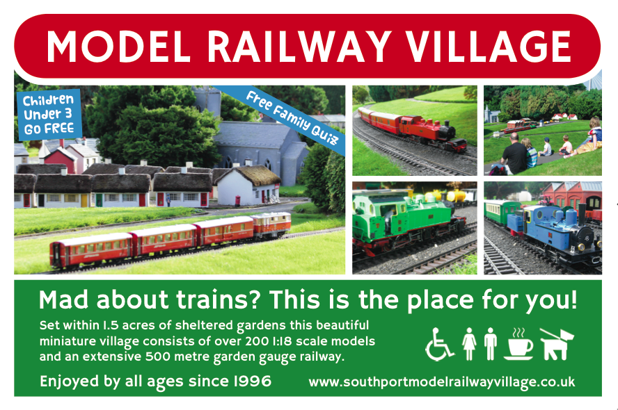
In addition to the online rebranding I provided design work for print, including a new leaflet design and outdoor signage.
Website Design Choices
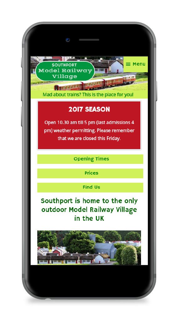
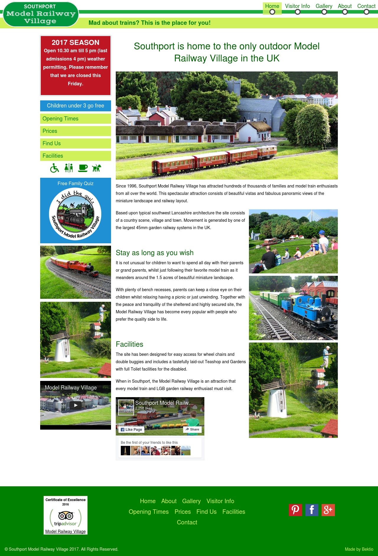
I wanted the importance of railways to come through the design elements of the page, but in a subtle way. For example the top navigation bar was inspired by the London underground tube lines. Also the pill shape of the main logo was influenced by the BRITISH RAILWAYS logo, frequently seen across the railway network and on transport posters of the 1950s (sometimes referred to as the flying sausage format).
Regarding the colour scheme, I chose a flat palette made up of colours to complement the photography of the village, pulling out the greens of the gardens and with accent colours of blue and red from favourite locomotives of the visitors.
The font choices were inspired by the traditional railway signage to give a feeling of nostalgia, yet needed to be readable on digital displays. I chose the display font Hammersmith One, as it has similarities in form to the London Underground font designed by Edward Johnston. It has good readability at a small size, important for coping well on mobile, and is a modern spin on an early 20th century classic.
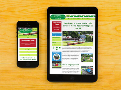
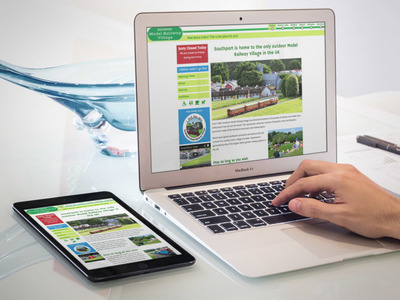
Regarding development I wrote custom media queries to scale and adapt the site well for mobile and tablets. Optimising page loading speeds for good performance on mobile.
On all sizes of screen I made sure the red banner, which sits on the front page is always above the fold of the page. It has priority as it provides key updates. This banner gives people a touchpoint to find out the current status of the attraction, due to it being outdoors and weather dependant.
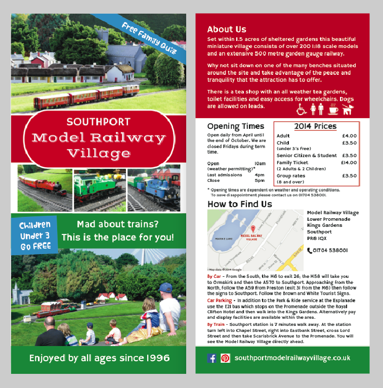
Leaflet design
Updated leaflets with the new branding.
Signs for outside the attraction
For outside signage I chose a different font for Model Railway Village logo to increase readability from a distance.
Jean and Ray Jones
Ray, Becky and Katie.

